
Colours have the capacity to impact and influence our mood. When carefully considered within the design of an interior, they can be used to promote mental and physical well-being, which becomes especially apparent in retirement when we spend more time at home.
Every colour has its own unique light wavelength and the energy of each shade has different properties that can boost our health.
As an earth colour, green is calming, positive and peaceful as it is reminiscent of nature. Yellow inspires feelings of warmth, happiness and joy. So as well as considering the most up to date colour trends, it’s important to consider how these are brought into an interior to create a well balanced environment.
Living coral is Pantone’s colour of the year 2019. Pantone have described it as ‘an animating and life–affirming coral hue with a golden undertone that energizes and enlivens with a softer edge.’ It’s a vibrant yet mellow colour, making it the perfect choice to be incorporated against a neutral colour palette.
We really wanted to bring this invigorating and fresh colour into the interior design of Audley Scarcroft, so we’ve created subtle reference to the colour throughout the scheme. We’ll be using coral cushions in the health and well-being areas to bring pops of colour to an otherwise neutral and calm setting. These little injections of colour bring joyfulness and positivity, whilst encouraging light-hearted activity.
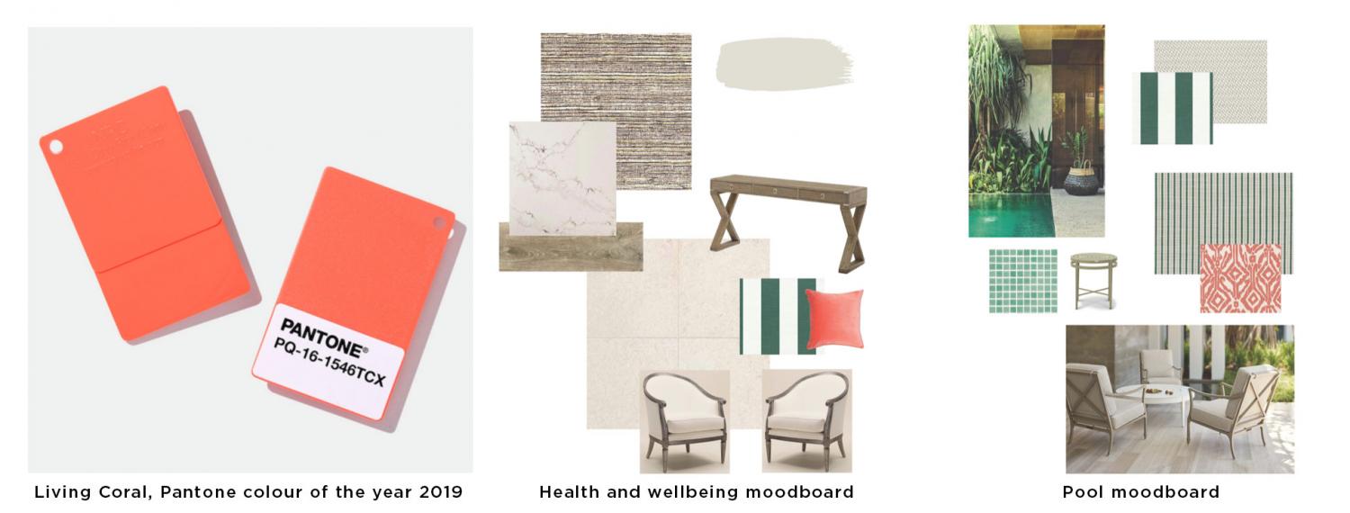
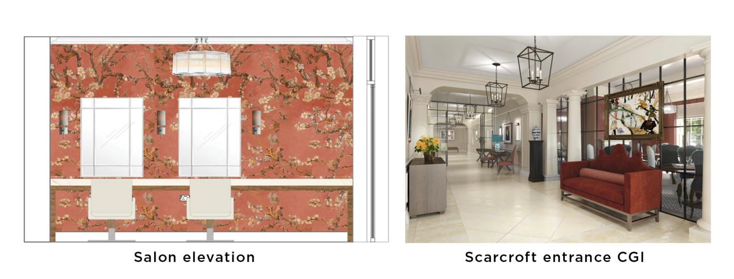
Coral can also be integrated into interiors in the form of artwork, upholstery and wall coverings and it doesn’t have to be the bright living coral colour either. Coral comes in many different variations and by using a more intense shade, it will bring a certain vintage allure. We will be using a warm coral patterned wallpaper in the salon area to bring comfort and to encourage feelings of relaxation. In the entrance, a bespoke Justin Van Breda sofa will be upholstered in a rich, muted coral velvet to stand out against a chalky white and limestone backdrop.
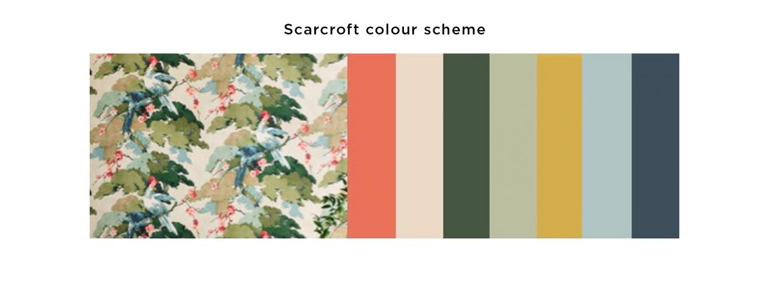
As well as being perfect for using in a neutral environment, coral also sits well as an accent colour against various other shades; sage green being one of those.
Pinterest’s annual trend report showed a major spike in searches for sage green.
Infact, green as a colour in general is a great colour to add to any interior as it brings relaxation and stress-relief in the same way that houseplants do. Dulux have just announced ‘Tranquil Dawn’ as their Colour of the Year for 2020.
Private dining moodboard
This cool shade of green is very similar to sage green and is meant to offer an antidote to an "increasingly disconnected" modern society. If you’re looking to introduce either bright pops of colour into your interior or a more subtle tone without using the traditional neutrals, coral and sage have a little bit of everything to boost feelings of positivity and well-being.
Dulux says that
Tranquil Dawn "embodies the nation's mood on the approach of a new decade"
and as a calm and timeless colour, it creates a tranquil atmosphere whilst adding a little more interest and personality than a traditional white or grey.
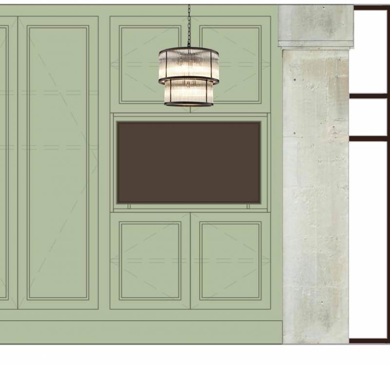
Private dining wall panelling
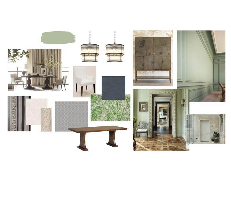
If you’re looking to add a subtle pop of colour into your interior, consider sage green as your new neutral as it can be used in combination with a variety of other brighter colours and finishes. As many colour trends come and go quickly, this green is definitely a colour that is here to stay due to its versatility and timelessness.
Again, we’ve chosen to use this shade of green throughout the interior of Audley Scarcroft. In the private dining room, sage green painted panelling will fit nicely with the existing exposed stone wall. Working in harmony with chalky whites and rich oak finishes, this soft shade will help to resonate a restful and harmonious environment.
Read more interior design and style tips from Jen Bernard...


